
In this next installment on health care, we will turn to the numbers. I’m a numbers guys, so I always like to look to the data to see what we can learn. There is so much information out there that could be researched and analyzed. I have gathered some key statistics from the World Health Organization which I believe shed some light on the state of health care in the U.S. We are going to explore some data revolving around two broad categories: health care spending and general health care data.
Spending on Health Care
First, we will look at health care spending. This review will look at total health expenditures as a percentage of GDP. The data is further categorized by government spending and private spending. The eighteen countries represented include the largest countries in the world as measured by GDP as well as a select few others based on either high per capita GDP and/or the Human Development Index. We will also look at the differences in spending between 2008 (about the time I wrote the original article as well as the state of affairs pre-Obamacare) and 2014 (the most recent year with data available).
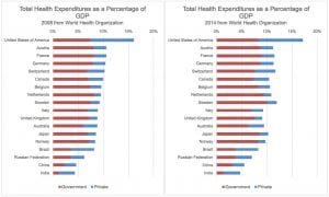
A few things jump out in this first set of data. The so-called “BRIC” countries of Brazil, Russia, India and China have substantially lower volumes of both government and overall spending as compared to the other countries. The BRIC countries aside, the other countries range from 6.3% (Australia) to 10.0% (Sweden) in terms of public health care spending (the red portion of the bars above). The U.S. is right in the middle at 8.3%. A few years ago, this placed the U.S. at number two (behind Norway) in terms of per capita government spending on health care; in 2014, Norway, Switzerland, Sweden, and the Netherlands all surpass the U.S. in this metric (not displayed in the chart).
Now we look at private (non-government) spending on health care as a percentage of GDP (in blue above). This data tells a much different story with the U.S. leading the way at 8.9% and no other country coming even close. Further, it only takes a quick glance of the data to quickly recognize that the U.S. spends far more on health care than any other country in the world. We rank number one in per capita spending, spending as a percent of GDP (17.1%), and, of course, in total nominal spending.
The key difference in the health care infrastructure between the U.S. and the other countries presented (the BRICs excluded) is that while the U.S. government appears to spend an ample amount on health care, there are even more expenses coming out of the private sector. This expense would only seem justified if there is either a structural need for higher health care expenses and/or the health care services are much better in the U.S.
Looking at Health Outcomes
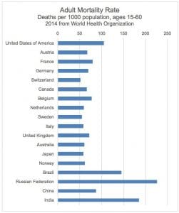
As we continue to break this down, I think it is important to see if there are health factors that may contribute to astronomical spending we see in the U.S. There are so many different health statistics that are available, but we are going to just look at the adult mortality rate. Without being too cynical, it should be pretty straightforward that the goal of health care is (should be) to keep people alive. When we look at this measure, it is interesting to see the U.S. having one of the largest rates in our group of eighteen countries. In fact, only Russia, India, and Brazil have higher mortality rates.
This is actually quite troubling. I would argue that there are unique socioeconomic factors that play into this for the U.S., but that is beyond the scope of this article. That said, could our higher mortality rate compared to our peer group be the reason we continue to pour more money into the health care system?
Health Services
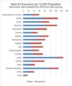
In the next and final table, we look at the number of hospital beds and physicians per 10,000 residents as a proxy for the level of service provided by the health care system. This is clearly not the only way to measure service, but it does provide a reasonable snapshot of whether or not the higher spending in the U.S. actually results in more bed or physicians. It does not. Note that the countries here are in the same order as the first chart where we sorted based on health care spending as a percentage of GDP.
.
What Does This Mean for the U.S?
All in all, it would appear that the public/private mix in the U.S. does not appear to provide the level of service or outcomes which would warrant the higher expenses that we have here. We need reform. We spend the most on health care which does not provide us with better outcomes. The key here is not that any one of the numbers that we have looked at is a definitive measure of health care quality. But, the amount we spend is so radically different than everywhere else in the world. And that radical difference is not providing any commensurate difference in other statistics that we have reviewed.